How to Start Your Business: Part Four (Back to the Fun: Logos)

Now that the boring stuff is over, let’s get back to the fun: logos and design!
A lot of the design elements start with what you like and what you don’t like. So scour the Internet and take note of websites where you like key design aspects: color, structure, and layout.
Do your best to disregard the industry, it really doesn’t matter. What matters is your design aesthetic. This blogpost has some great examples of popular web design styles, but you may like some of these the best:
- Artistic (Think hand drawings, water color splashes, and cartoons)
- Gallery (Think photography websites with an emphasis large photos or videos)
- Grunge (Think of the currently very popular smudgey, vintage look)
- Minimalist (Think lots of white, with an emphasis on structure)
From there (plus your business name), a logo will start to take shape. It may take many steps to go from the beginning to the final version of the logo, so be sure to only make minor tweaks along the way. That way, you’ll really be able to see whether a change helped or hurt your cause.
As an example, here’s where Corey and I started:
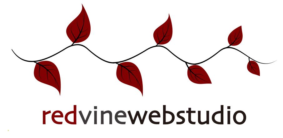
And here is the final version:
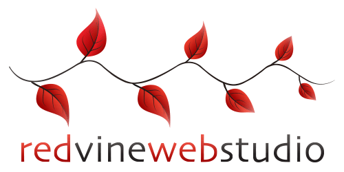
Not drastically different, but there were definitely a few steps taken along the way! You can also start with several different options at the beginning, and your favorite direction will start to take light.
Make sure that once you have your final logo you have it in multiple sizes, at the very least:
- A small version – 250 pixels by whatever (For those times you cannot go over a certain file size)
- A square – 500 x 500 pixels (This logo can have white space on the sides or above/below and is for social profile photos)
- A large version – at least 800 pixels by whatever (That can be scaled down, if need be)
Step 5 (the logo), check. Next up? The design and website.